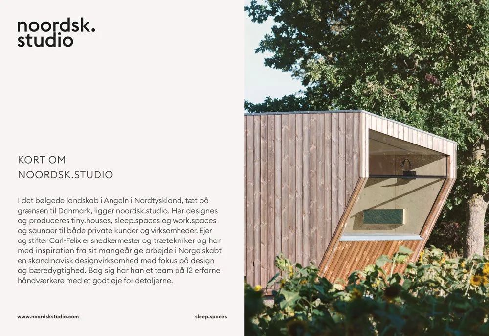
a considered update for a design woodworking company
art direction for noordsk.studio
noordsk.studio wanted a refreshed brand identity that reflected their quiet, nordic approach. In collaboration with graphic designer Merle Hagedorn, we supported noordsk.studio through a complete rebranding process.
My role focused on project management and creative direction. Together, we developed a new homepage, colour concept, printed materials, included new photos and a clear visual presence for market placement.
The result is a brand that feels cohesive, grounded, and true to noordsk.studio’s values: calm, intentional, and carefully made.
rebranding noordsk.studio
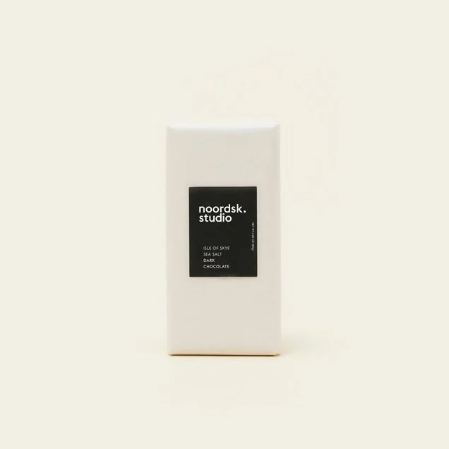
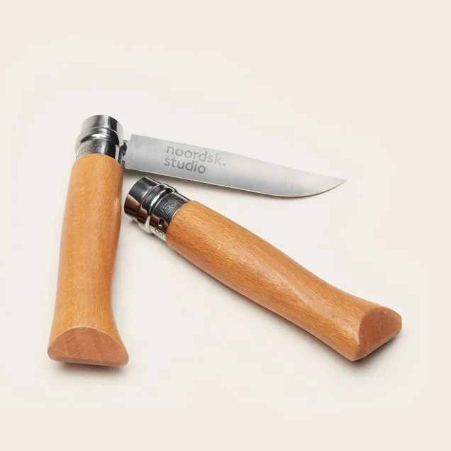
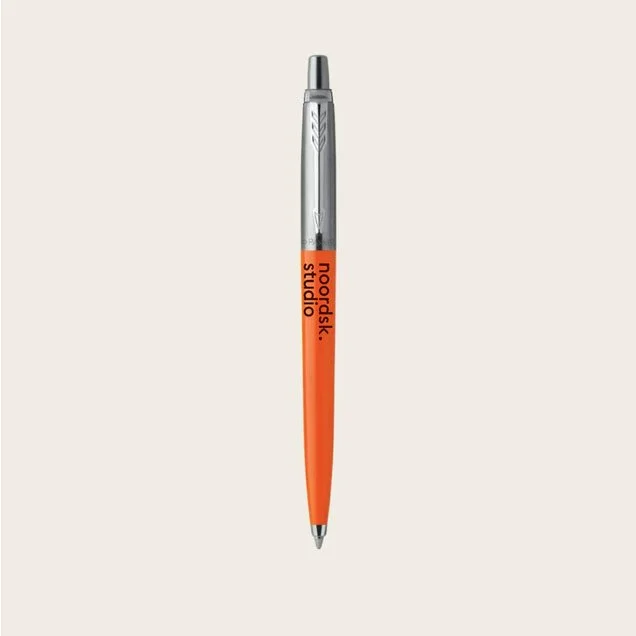
In the rebranding process, our focus was on high quality: expressed through design, materials, and craftsmanship. The work involved interviews and a workshop with employees. We prioritized high‑quality photography, clean graphic design, and a muted, natural color palette anchored by deep green with a highlight orange. The refreshed logo was applied to sustainable workwear, and we proposed a range of premium merchandise that reinforces the brand values and image of noordsk.studio.
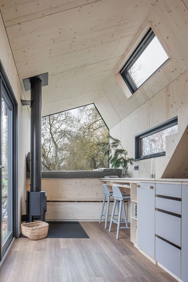
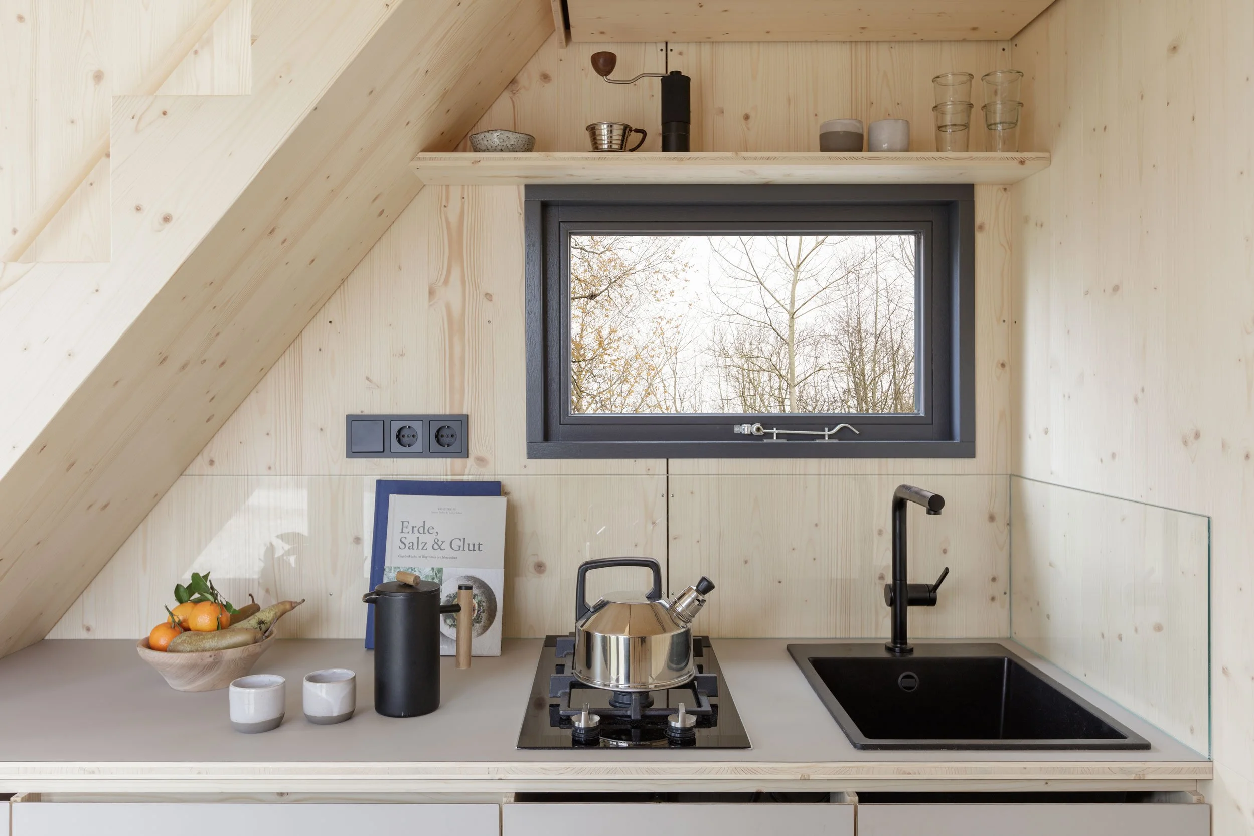
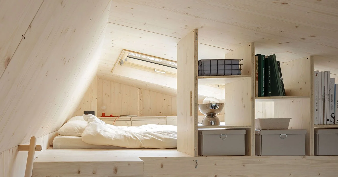
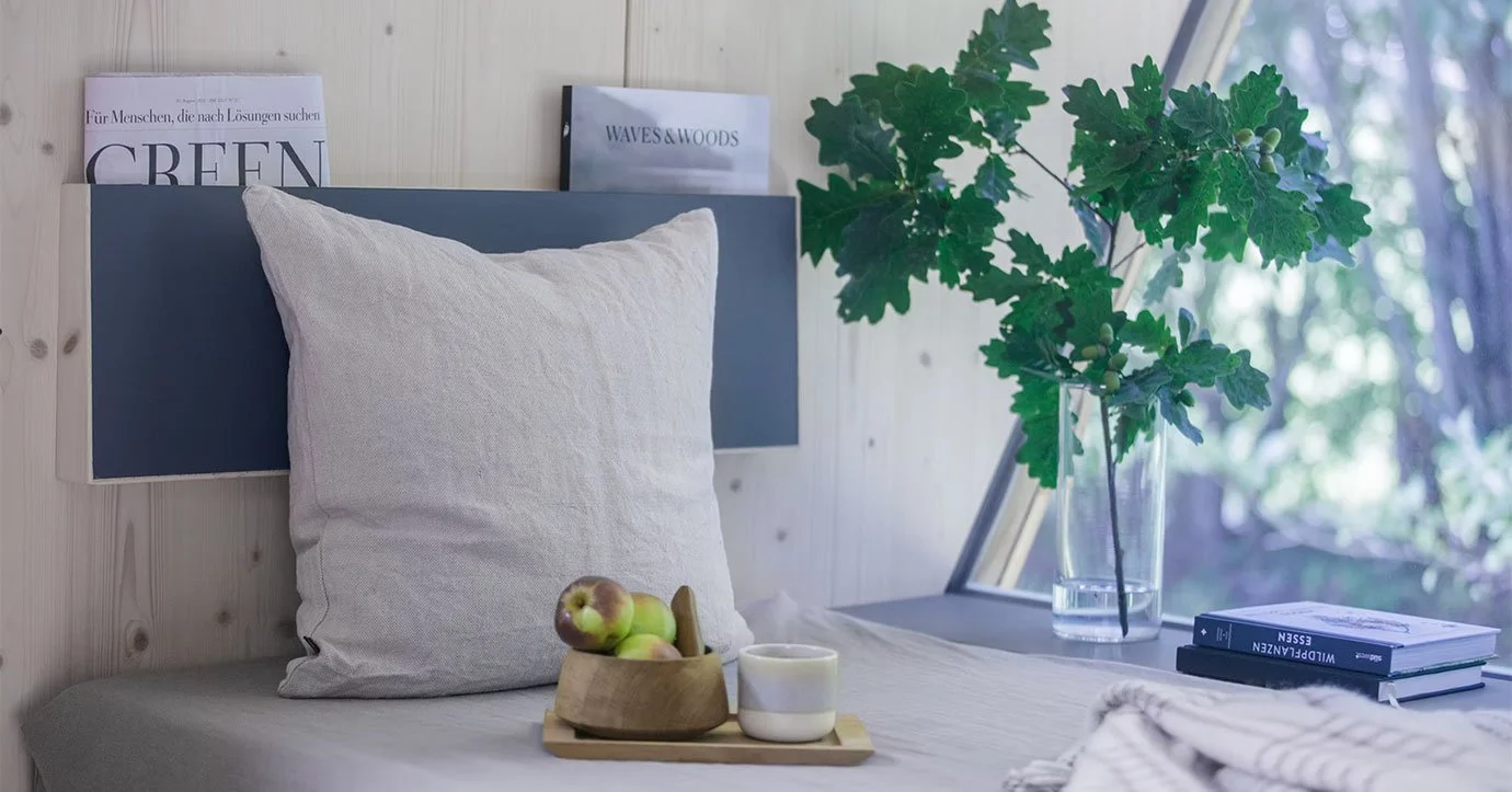
photography by Bernd Jonas - interieur of living.space
print material for fairs and client meetings

look of new homepage